Pretty ggplots with custom themes, ggtext, and ggh4x
Intro
Sometimes I have an idea of something I’d like to share that’s too big for a tweet thread or entry in my R Snippets repo, but I’m too lazy to flesh it out into a full, nicely written blog post. I find these ideas are often useful, but end up floundering and remain unshared. To counteract that, I’m just gonna do a rough sketch blog post walking through some useful bits of a recent exercise of mine.
I have been working on a new ggplot2 theme for my own personal use,
not for any professional settings. I wanted something fun and
distinctive, with flexibility to push plots towards a more polished and
completed look. While working on building the theme, I found myself
pushing one of my example plots into one of these more polished,
cool-looking plots you sometimes see shared online. Now, mine is paltry
compared to some of the really cool data visualizations people make in
R.
There are a few recent blog posts and visualizations I’ve seen that inspired me to try making some more in-depth plots. Albert Rapp has a few fantastic blog posts recreating more complex plots here and here, and Bob Rudis does something similar here. Finally, the filmicaesthetic GitHub account has a couple gorgeous plot/infographics to check out.
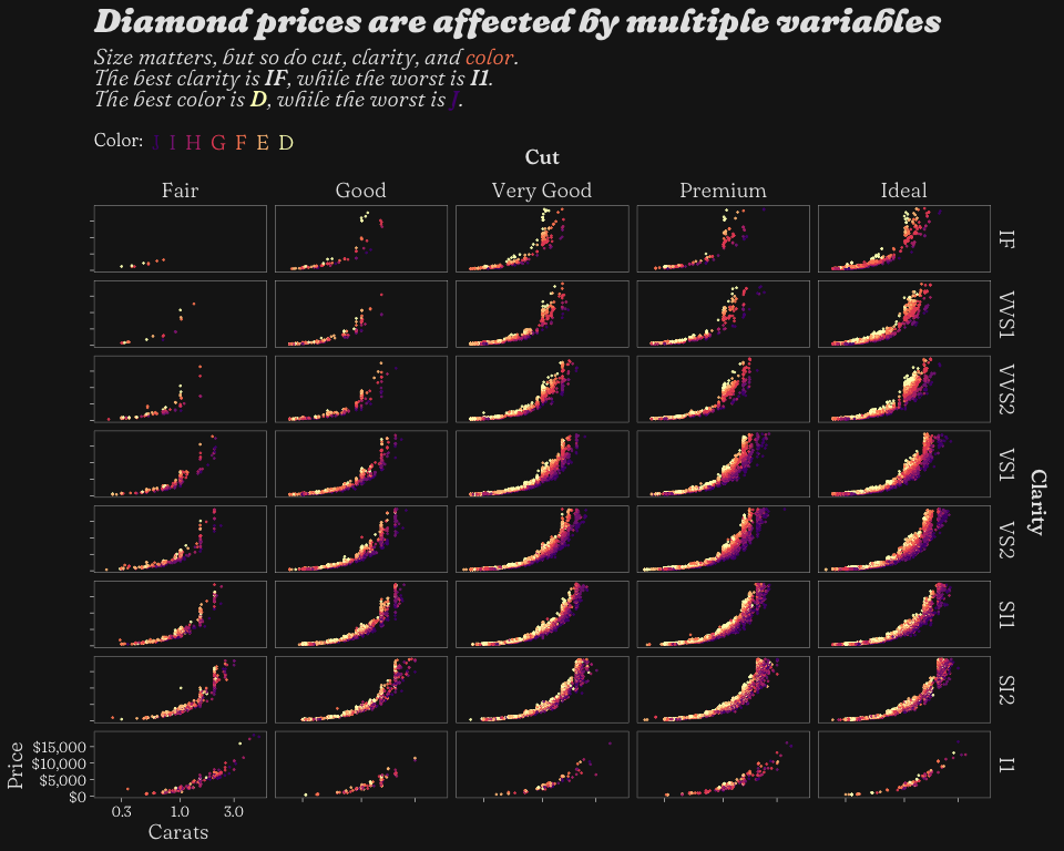
Here is my final plot and the code necessary to generate it:
p <- diamonds %>%
  mutate(cutname = "Cut", clarityname = "Clarity",
         color = fct_rev(color),
         clarity = fct_rev(clarity)) %>%
  ggplot(aes(x = carat, y = price, color = color)) +
  geom_point(size = 0.2, alpha = 0.8) +
  theme_mcm_dark(facet_outlines = T) +
  scale_color_viridis_d(option = "A", begin = 0.25,
                        guide = guide_stringlegend(nrow = 1, title.vjust = 1.1)) +
  theme(legend.position = "top",
        legend.margin = margin(0,0,0,0),
        legend.box.margin = margin(10,0,-20,0),
        legend.direction = "horizontal",
        legend.justification = "left",
        axis.ticks = element_line(),
        axis.title.x = element_text(hjust = 0.065),
        axis.title.y = element_text(hjust = 0.015)) +
  facet_nested(rows = vars(clarityname, clarity),
               cols = vars(cutname, cut),
               strip = strip_nested(text_x =
                                      elem_list_text(
                                        family =
                                        c("FrauncesSuperSoftWonky-Medium",
                                          rep(NA, 100))),
                                    text_y =
                                      elem_list_text(
                                        family =
                                        c("FrauncesSuperSoftWonky-Medium",
                                            rep(NA, 100)))),
               scales = "free") +
  facetted_pos_scales(
    x = list(
      cut == "Fair" ~ scale_x_log10(limits = range(diamonds$carat)),
      cut != "Fair" ~ scale_x_log10(limits = range(diamonds$carat),
                                    labels = NULL)
    ),
    y = list(
      clarity == "I1" ~ scale_y_continuous(limits = range(diamonds$price),
                                           labels = scales::label_dollar()),
      clarity != "I1" ~ scale_y_continuous(limits = range(diamonds$price),
                                         labels = NULL)
    )
  ) +
  labs(title = "Diamond prices are affected by multiple variables",
       subtitle = "Size matters, but so do cut, clarity, and <span style = 'color:#FB8861FF;'>color</span>.<br>The best clarity is <span style = 'font-family:FrauncesSuperSoftWonky-MediumItalic;'>IF</span>, while the worst is <span style = 'font-family:FrauncesSuperSoftWonky-MediumItalic;'>I1</span>.<br>The best color is <span style = 'color:#FCFDBFFF;font-family:FrauncesSuperSoftWonky-MediumItalic;'>D</span>, while the worst is <span style = 'color:#51127CFF;font-family:FrauncesSuperSoftWonky-MediumItalic;'>J</span>.",
       x = "Carats",
       y = "Price",
       color = "Color:")

p
There is a lot going on here, but I’ll touch on pretty much all the
more obscure stuff. There is a lot of code here, but one thing to note
is that the whole plot is programmatically generated with relatively
little “manual” tweaking. There are a few nudges of titles (note the
hjust and vjust arguments), and some manually-set hex codes for
colors, but there is zero external adjusting with anything outside of R.
I’ll start off talking about theme_mcm_dark() and building custom
ggplot2 themes, then move on to some tricks using the fantastic
ggtext and ggh4x packages.
Custom Theme
This whole plot started off with me trying to develop a cool custom
ggplot2 theme, and you can see the final version here:
theme_mcm_dark <- function(base_family = "FrauncesSuperSoftWonky-Light",
                           title_family = "FrauncesSuperSoftWonky-BlackItalic",
                           subtitle_family = "FrauncesSuperSoftWonky-LightItalic",
                           axis_family = "FrauncesSuperSoftWonky-Light",
                           base_color = "white",
                           primary_color = "grey10",
                           accent_color = "grey90",
                           gridlines = F,
                           facet_outlines = F,
                           base_size = 10) {
  min_theme <- theme_bw() +
    theme(
      text = element_text(
        family = base_family,
        colour = base_color,
        size = base_size
      ),
      line = element_line(
        colour = base_color,
        size = 0.2),
      legend.background = element_blank(),
      legend.key = element_blank(),
      panel.background = element_blank(),
      panel.border = element_rect(
        fill = NA,
        colour = base_color,
        size = 0.2
      ),
      strip.background = element_blank(),
      axis.line = element_blank(),
      panel.grid.minor = element_blank(),
      axis.ticks = element_blank(),
      plot.background = element_rect(fill = primary_color, color = NA),
      axis.text = element_text(
        family = base_family,
        colour = base_color,
        size = base_size
      ),
      plot.title = element_markdown(
        family = title_family,
        colour = accent_color,
        size = base_size * 1.5 ^ 2
      ),
      plot.subtitle = element_markdown(
        family = subtitle_family,
        colour = accent_color,
        size = base_size * 1.5
      ),
      axis.title = element_markdown(
        family = axis_family,
        colour = accent_color,
        size = base_size * 1.4
      ),
      strip.text = element_markdown(
        family = axis_family,
        colour = accent_color,
        size = base_size * 1.4
      ),
      legend.text = element_markdown(
        family = axis_family,
        colour = accent_color,
        size = base_size * 1.4
      ),
      legend.title = element_markdown(
        family = base_family,
        colour = base_color,
        size = base_size * 1.2
      )
    )

  if (!gridlines) {
    min_theme <- min_theme + theme(panel.grid = element_blank())
  }

  if (!facet_outlines) {
    min_theme <- min_theme + theme(panel.border = element_blank())
  }

  return(min_theme)
}
The goal here is not for the theme to be a be-all end-all choice, but a
reasonable starting point for a lot of situations, and to provide a
consistent appearance for a bunch of plots. It reduces how much I have
to type out each time, but you’ll see that I still ended up changing
some additional stuff in theme() in my plot above.
Setting things like base_size and base_font is common in ggplot2
themes, like theme_bw(), but I also have a couple Boolean arguments
for common things I like to turn on/off: gridlines and
facet_outlines. I also really like setting a bunch of default
arguments as a way to reduce typing but keep flexibility for changing
things like fonts if need be.
Another thing I find frustrating is changing a bunch of font sizes for
different plot elements, especially when there are some general
guidelines, like “the title should be bigger than the axis labels”. So
the way I have it set up is to set a base font size, and then scale
things like plot.title and axis.title from that. You can change up
the relative scalings however you like.
For inspiration on making custom themes, I’d recommend checking out Urban Institute’s fantastic style guide and Bob Rudis’ custom themes.
element_markdown()
You may notice that inside theme_mcm_dark(), there are a bunch of
element_markdown() calls. These come from the wonderful ggtext
package, and they replace the
standard element_text() with text that has fuller Markdown
capabilities. This is how I did stuff like use a CSS <span> to change
the colors and fonts of text in the plot subtitle. Your text strings may
get a bit bulky, but it’s super powerful.
Other Extensions
Getting hex codes from color scale
One thing that has to be done semi-manually is pulling out hex color
codes generated by scale_color_viridis_d() for use in the subtitle.
The easiest way I know to do this is to use ggplot_build() to build
the plot and pull out a vector of unique colors, then use the
swatchplot() function from the colorspace
package to view
them and pick the right codes.
g <- ggplot_build(p)

cols <- unique(g$data[[1]]$colour)

cols
## [1] "#FEC287FF" "#822681FF" "#51127CFF" "#B63679FF" "#FB8861FF" "#E65164FF"
## [7] "#FCFDBFFF"
colorspace::swatchplot(cols)
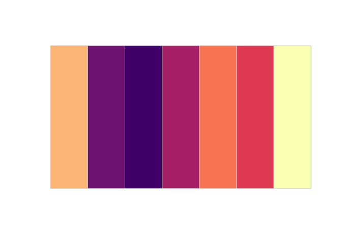
If you wanted to do this more automatically, you could probably generate
a dummy plot with the correct number of color levels in order, pull out
the first and last hex codes, and paste them into the subtitle string.
ggh4x
A lot of the cool parts of this plot that would normally have to be done
manually are made possible by the amazing ggh4x
package, which I cannot
recommend highly enough. I’ll walk through several of the functions I
used, but the package can do way more cool stuff.
facet_nested() to get variable name
I don’t always love the naming options for facets. By default, the
values for cut would just be listed on their own: Fair, Good, etc.
You can use label_both() to generate something like Cut: Fair,
Cut: Good, and so on, but that’s a lot of redundant text. I far prefer
to put Cut once, above all the facets.
The function facet_nested() allows you to do stuff like nest facets for cities within states, but we can also use it as a hack-ish
way to put Cut and Clarity above their respective facets. We make
dummy variables called cutname and clarityname, then use those
variables inside facet_nested().
strip_nested() to bold the variable names
strip = strip_nested(text_x =
                       elem_list_text(
                         family =
                           c("FrauncesSuperSoftWonky-Medium",
                             rep(NA, 100))),
                     text_y =
                       elem_list_text(
                         family =
                           c("FrauncesSuperSoftWonky-Medium",
                             rep(NA, 100))))
To make the names Cut and Clarity stand out a little bit, I’d like
change their text to a heavier font. However, they are just strip
labels, treated the same as the actual facet labels like Fair and
Good. We can use strip_nested() to set the formatting for each strip
label. Since the first label is Cut or Clarity, I adjust the first
strip labels, and then use rep(NA, 100) to say “all the other strips
should be the default”.
guide_stringlegend()
A relatively simple, but beautiful, function in ggh4x is
guide_stringlegend(). If you have a discrete color scale, the default
legend is a square of each color with a label next to it. However,
guide_stringlegend() will just write out each label in that level’s
color. I had to use title.vjust when doing it with a horizontal legend
or the title wasn’t aligned with the labels.
facetted_pos_scales() to remove redundant facet axis labels
One slightly complicated thing I did was remove the facet labels from all but the bottom left facet. When plotting small multiples like this, I don’t think the repeated scales are all that useful, and they just clutter up the plot. However, removing them is a bit tricky.
I used the facetted_pos_scales() function from ggh4x to
programmatically set the scales to be used for each facet. It requires
that we set scales = "free" in our facet_ function. Once we do that,
we get to use nice little formulas with ~ notation, just like the
case_when() function.
facetted_pos_scales(
    x = list(
      cut == "Fair" ~ scale_x_log10(limits = range(diamonds$carat)),
      cut != "Fair" ~ scale_x_log10(limits = range(diamonds$carat),
                                    labels = NULL)
    ),
    y = list(
      clarity == "I1" ~ scale_y_continuous(limits = range(diamonds$price),
                                           labels = scales::label_dollar()),
      cut != "I1" ~ scale_y_continuous(limits = range(diamonds$price),
                                         labels = NULL)
    )
  )
The lefthand side of the ~ is a condition, and the righthand side is
the scale to use if that condition is met. I was thinking about doing
the middle facet for both Cut and Clarity, but there are an even
number of levels for Clarity and it just didn’t look great, so I opted
for the bottom left facet.
There are a couple key details to note. First, setting labels = NULL
is used to turn off the labels for most of the facets. Second, since we
set scales = "free", the range of our scales will vary by row/column.
Since I don’t actually want the scales to be free (I only had to do it
to use facetted_pos_scales()), I set the limits inside each scale
function to the range of the x and y variables in the diamonds
dataframe, ensuring that all the facets have the same range, just like
scales = "fixed" would give us. Finally, inside theme() I need to
nudge the positions of the axis titles to get them to align with this
single facet.
Conclusion
I hope this was a useful look at my process for making a custom theme
and a fancier ggplot. I really love reading more in-depth blog posts
that dig into a particular topic, but at times I find I pick up a lot of
useful little tips and tricks when seeing a single thing tackled from
start to finish. I hope you find this useful as well!