Data visualization with ggplot2
Learning Objectives
- Produce scatter plots, boxplots, and time series plots using ggplot.
- Set universal plot settings.
- Describe what faceting is and apply faceting in ggplot.
- Build complex and customized plots from data in a data frame.
We start by loading the required packages. ggplot2 is included in the tidyverse package.
library(tidyverse)Let’s read in our surveys data, but filter it to only get back rows where ALL the data are present, also known as “complete cases”. We’re also showing you a new little trick: using a period with a pipe. Normally, a pipe just sends the stuff on the left into the FIRST argument position in the function on the right. However, sometimes we want that stuff to get sent to a slightly different place in the righthand function. In this case, we want to send it into the complete.cases() function, so that function will run on the whole dataset. In order to specifically tell the pipe to send the lefthand side into this function, we put a period there. You can think of this as the target for the pipe.
surveys_complete <- read_csv("data/portal_data_joined.csv") %>%
  filter(complete.cases(.))
Plotting with ggplot2
ggplot2 is a plotting package that makes it simple to create complex plots from data in a data frame. It provides a more programmatic interface for specifying what variables to plot, how they are displayed, and general visual properties. Therefore, we only need minimal changes if the underlying data change or if we decide to change from a bar plot to a scatterplot. This helps in creating publication quality plots with minimal amounts of adjustments and tweaking.
ggplot2 functions like data in the ‘long’ format, i.e., a column for every dimension, and a row for every observation. Well-structured data will save you lots of time when making figures with ggplot2
ggplot graphics are built step by step by adding new elements. Adding layers in this fashion allows for extensive flexibility and customization of plots.
To build a ggplot, we will use the following basic template that can be used for different types of plots:
ggplot(data = <DATA>, mapping = aes(<MAPPINGS>)) + <GEOM_FUNCTION>()- use the
ggplot()function and bind the plot to a specific data frame using thedataargument
ggplot(data = surveys_complete)- define a mapping (using the aesthetic (
aes) function), by selecting the variables to be plotted and specifying how to present them in the graph, e.g. as x/y positions or characteristics such as size, shape, color, etc.
ggplot(data = surveys_complete, mapping = aes(x = weight, y = hindfoot_length))add ‘geoms’ – graphical representations of the data in the plot (points, lines, bars).
ggplot2offers many different geoms; we will use some common ones today, including:* `geom_point()` for scatter plots, dot plots, etc. * `geom_boxplot()` for, well, boxplots! * `geom_line()` for trend lines, time series, etc.
To add a geom to the plot use the + operator. Because we have two continuous variables, let’s use geom_point() first:
ggplot(data = surveys_complete, mapping = aes(x = weight, y = hindfoot_length)) +
  geom_point()
The + in the ggplot2 package is particularly useful because it allows you to modify existing ggplot objects. This means you can easily set up plot templates and conveniently explore different types of plots, so the above plot can also be generated with code like this:
# Assign plot to a variable
surveys_plot <- ggplot(data = surveys_complete,
                       mapping = aes(x = weight, y = hindfoot_length))

# Draw the plot
surveys_plot +
    geom_point()
Notes
- Anything you put in the
ggplot()function can be seen by any geom layers that you add (i.e., these are universal plot settings). This includes the x- and y-axis mapping you set up inaes(). - You can also specify mappings for a given geom independently of the mappings defined globally in the
ggplot()function. - The
+sign used to add new layers must be placed at the end of the line containing the previous layer. If, instead, the+sign is added at the beginning of the line containing the new layer,ggplot2will not add the new layer and will return an error message.
# This is the correct syntax for adding layers
surveys_plot +
  geom_point()

# This will not add the new layer and will return an error message
surveys_plot
  + geom_point()
Building your plots iteratively
Building plots with ggplot2 is typically an iterative process. We start by defining the dataset we’ll use, lay out the axes, and choose a geom:
ggplot(data = surveys_complete, mapping = aes(x = weight, y = hindfoot_length)) +
    geom_point()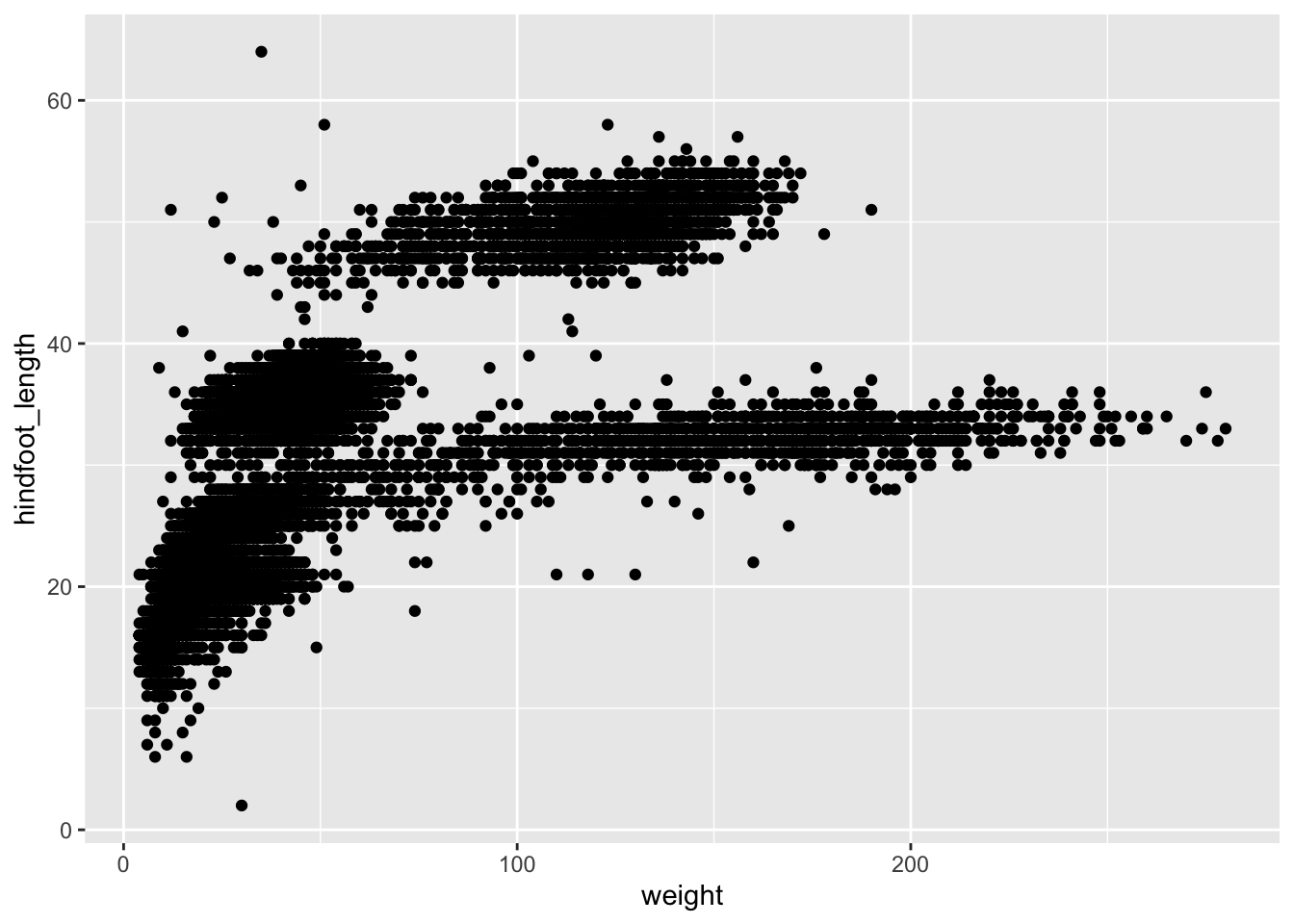
Then, we start modifying this plot to extract more information from it. For instance, we can add transparency (alpha) to avoid overplotting:
ggplot(data = surveys_complete, mapping = aes(x = weight, y = hindfoot_length)) +
geom_point(alpha = 0.1)![]()
We can also add colors for all the points:
ggplot(data = surveys_complete, mapping = aes(x = weight, y = hindfoot_length)) +
    geom_point(alpha = 0.1, color = "blue")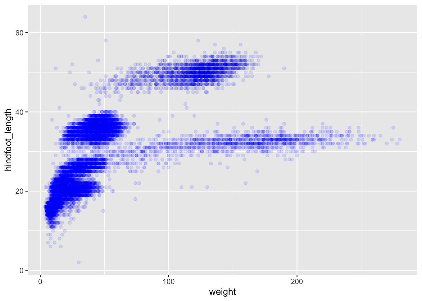
Or to color each species in the plot differently, you could use a vector as an input to the argument color. ggplot2 will provide a different color corresponding to different values in the vector. Here is an example where we color with species_id:
ggplot(data = surveys_complete, mapping = aes(x = weight, y = hindfoot_length)) +
    geom_point(alpha = 0.1, aes(color = species_id))
We can also specify the colors directly inside the mapping provided in the ggplot() function. This will be seen by all geom layers and the mapping will be determined by the x- and y-axis set up in aes().
ggplot(data = surveys_complete, mapping = aes(x = weight, y = hindfoot_length, color = species_id)) +
    geom_point(alpha = 0.1)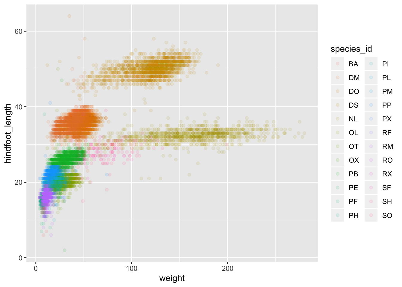
Notice that we can change the geom layer and colors will be still determined by species_id
Challenge
Use what you just learned to create a scatter plot of weight and species_id with weight on the Y-axis, and species_id on the X-axis. Have the colors be coded by plot_type. Is this a good way to show this type of data? What might be a better graph?
ANSWER
ggplot(data = surveys_complete, mapping = aes(x = species_id, y = weight)) +
   geom_point(aes(color = plot_type))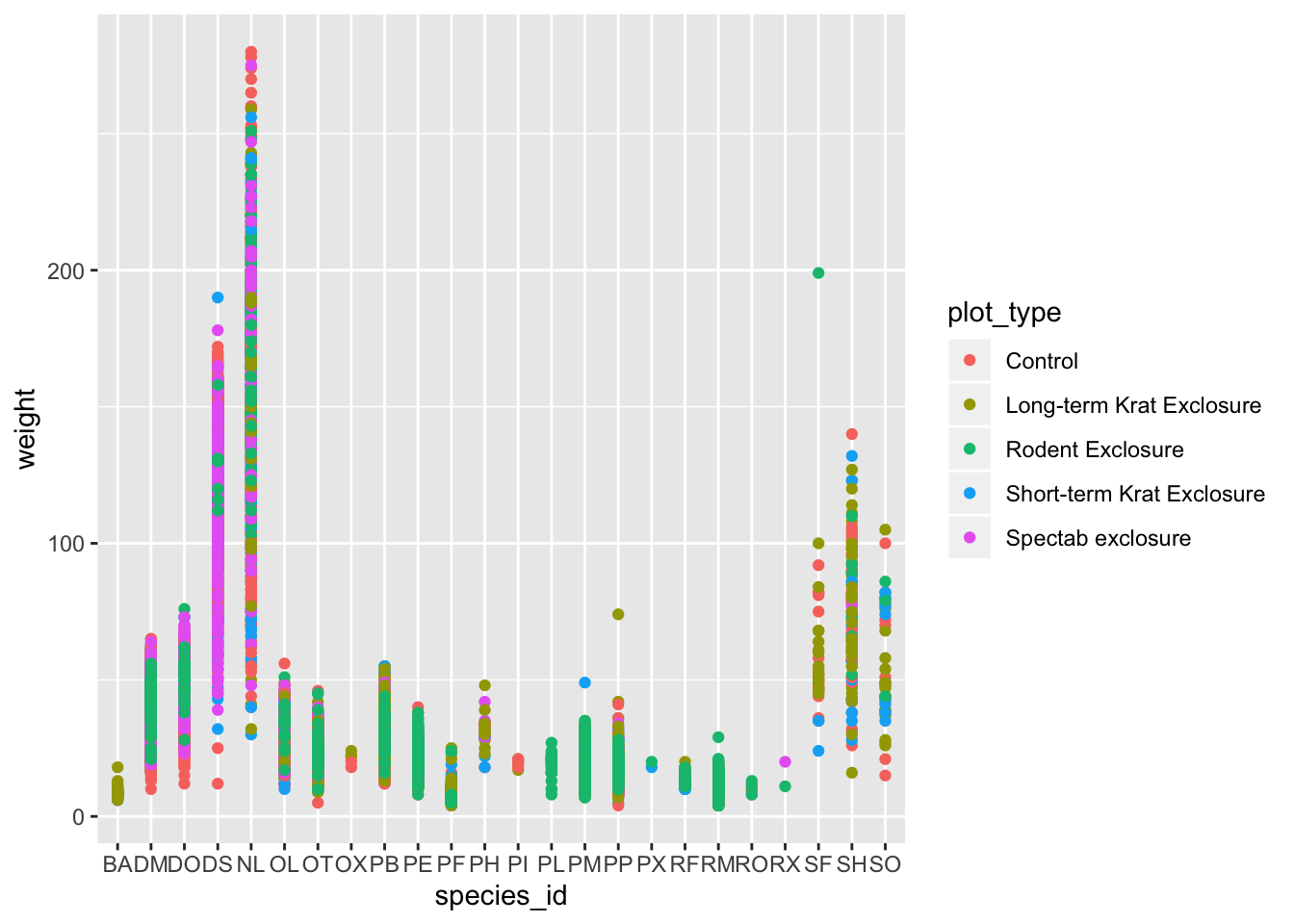
Boxplot
We can use boxplots to visualize the distribution of weight within each species:
ggplot(data = surveys_complete, mapping = aes(x = species_id, y = weight)) +
    geom_boxplot()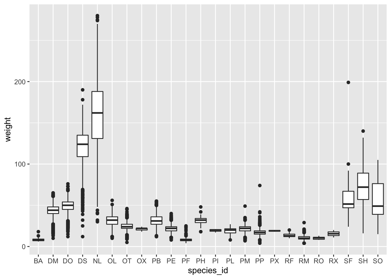
By adding points to boxplot, we can have a better idea of the number of measurements and of their distribution.
Let’s also use the geometry “jitter”. geom_jitter is almost like geom_point but it allows you to visualize how the density of points because it adds a small amount of random variation to the location of each point.
ggplot(data = surveys_complete, mapping = aes(x = species_id, y = weight)) +
    geom_boxplot(alpha = 0) +
geom_jitter(alpha = 0.3, color = "tomato") #notice our color needs to be in quotations 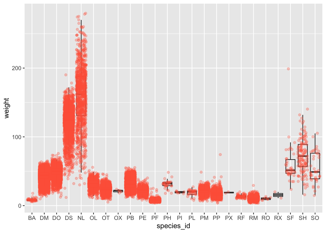
Notice how the boxplot layer is behind the jitter layer? What do you need to change in the code to put the boxplot in front of the points such that it’s not hidden?
Challenges
- Boxplots are useful summaries, but hide the shape of the distribution. For example, if the distribution is bimodal, we would not see it in a boxplot. An alternative to the boxplot is the violin plot, where the shape (of the density of points) is drawn.
- Replace the box plot with a violin plot; see
geom_violin().
- In many types of data, it is important to consider the scale of the observations. For example, it may be worth changing the scale of the axis to better distribute the observations in the space of the plot. Changing the scale of the axes is done similarly to adding/modifying other components (i.e., by incrementally adding commands). Try making these modifications:
- Represent weight on the log10 scale; see
scale_y_log10().
- Make a new plot to explore the distrubtion of
hindfoot_lengthjust for species NL and PF. Overlay a jitter plot of the hindfoot lengths of each species by a boxplot. Then, color the datapoints according to the plot from which the sample was taken.
Hint: Check the class for plot_id. Consider changing the class of plot_id from integer to factor. Why does this change how R makes the graph?
ANSWER
#1 + 2

ggplot(data = surveys_complete, mapping = aes(x = species_id, y = weight)) +
    geom_jitter(alpha = 0.3, color = "tomato") +
    geom_violin(alpha = 0) +
    scale_y_log10()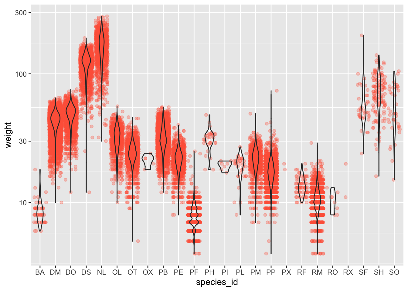
#3
surveys_complete %>%
  filter(species_id == "NL" | species_id == "PF") %>%
ggplot(mapping = aes(x= species_id, y = hindfoot_length)) +
  geom_jitter(alpha = 0.3, aes(color = as.factor(plot_id))) +
  geom_boxplot()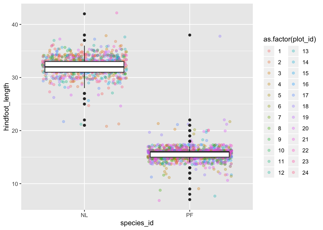
Plotting time series data
Let’s calculate number of counts per year for each species. First we need to group the data and count records within each group. We can quickly use the dplyr function count to do this. count is very similar to the function tally we have seen before, but it interally calls group_by before the function and ungroup after.
yearly_counts <- surveys_complete %>%
                 count(year, species_id)
Time series data can be visualized as a line plot with years on the x axis and counts on the y axis:
ggplot(data = yearly_counts, mapping = aes(x = year, y = n)) +
     geom_line()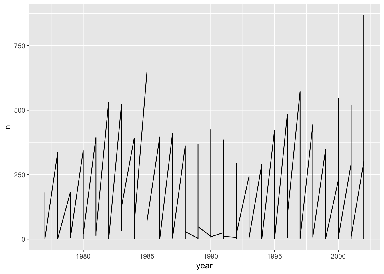
Unfortunately, this does not work because we plotted data for all the species together. We need to tell ggplot to draw a line for each species by modifying the aesthetic function to include group = species_id:
ggplot(data = yearly_counts, mapping = aes(x = year, y = n, group = species_id)) +
    geom_line()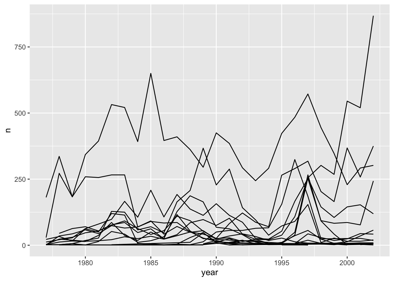
We will be able to distinguish species in the plot if we add colors (using color also automatically groups the data):
ggplot(data = yearly_counts, mapping = aes(x = year, y = n, color = species_id)) +
    geom_line()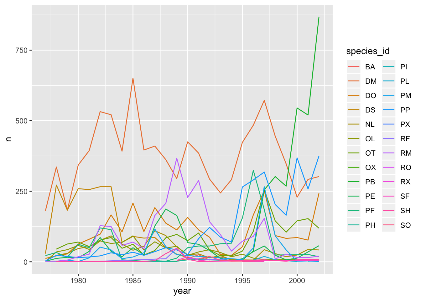
Faceting
ggplot2 has a special technique called faceting that allows the user to split one plot into multiple plots based on a factor included in the dataset. We will use it to make a time series plot for each species:
ggplot(data = yearly_counts, mapping = aes(x = year, y = n)) +
    geom_line() +
    facet_wrap(~ species_id)
## geom_path: Each group consists of only one observation. Do you need to
## adjust the group aesthetic?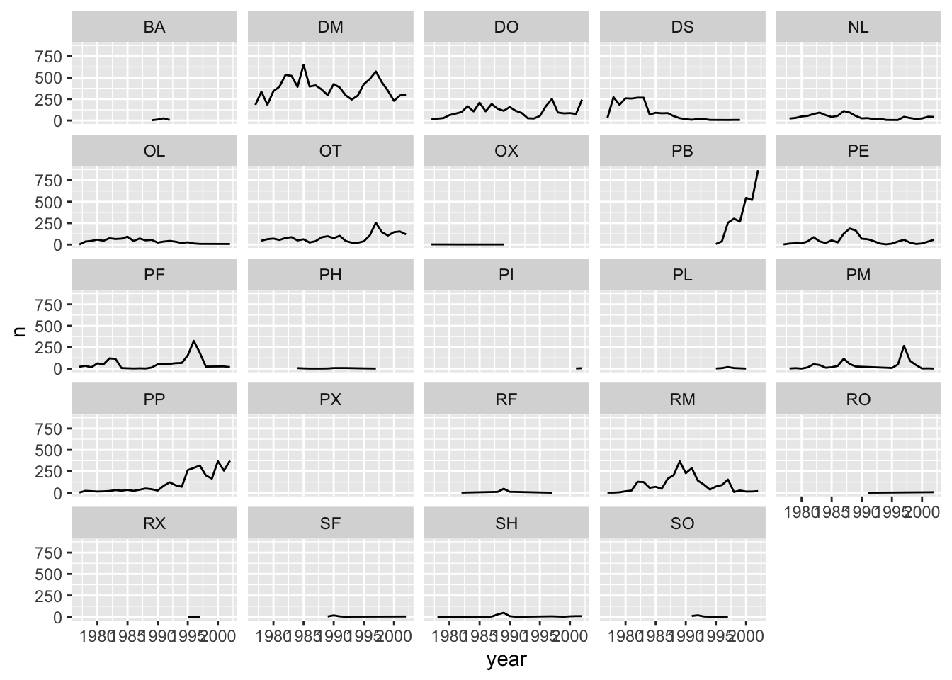
ggplot2 themes
ggplot Themes are a great, easy addition that can make all your plots more readable (and a lot more pretty!)
In addition to theme_bw(), which changes the plot background to white, ggplot2 comes with several other themes which can be useful to quickly change the look of your visualization. The complete list of themes is available at http://docs.ggplot2.org/current/ggtheme.html. theme_minimal() and theme_light() are popular, and theme_void() can be useful as a starting point to create a new hand-crafted theme.
Usually plots with white background look more readable when printed. We can set the background to white using the function theme_bw(). Additionally, you can remove the grid:
 ggplot(data = yearly_counts, mapping = aes(x = year, y = n)) +
     geom_line() +
     facet_wrap(~ species_id) +
     theme_bw() +
     theme(panel.grid = element_blank())
## geom_path: Each group consists of only one observation. Do you need to
## adjust the group aesthetic?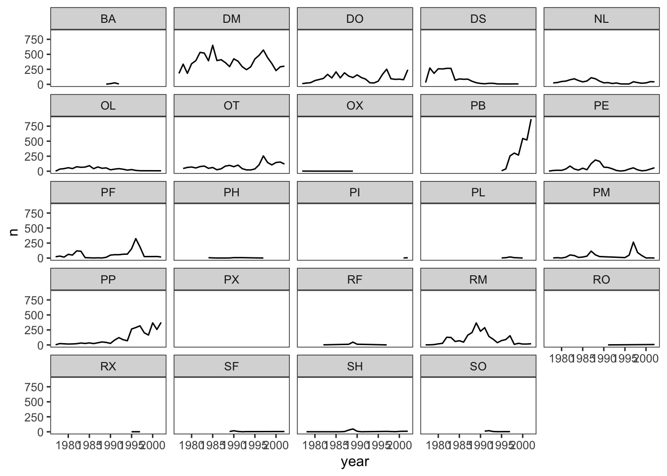
Challenge 1
Let’s make one final change to our facet wrapped plot of our yearly count data. What if we wanted to split the counts of species up by sex where the lines for each sex are different colors? Make sure you have a nice theme on your graph too!
Hint Make a new dataframe using the count function we learned earlier!
ANSWER
#new data frame counting the number of each sex of each species
 yearly_sex_counts <- surveys_complete %>%
                      count(year, species_id, sex)

#plot code
 ggplot(data = yearly_sex_counts, mapping = aes(x = year, y = n, color = sex)) +
     geom_line() +
     facet_wrap(~ species_id) +
     theme_bw()
## geom_path: Each group consists of only one observation. Do you need to
## adjust the group aesthetic?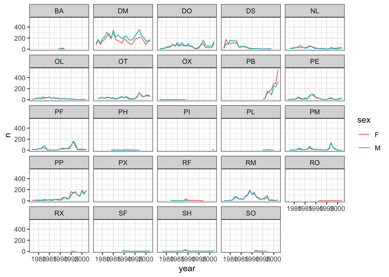
Challenge 2
Use what you just learned to create a plot that depicts how the average weight of each species changes through the years.
ANSWER
#create a new dataframe
yearly_weight <- surveys_complete %>%
                 group_by(year, species_id) %>%
                 summarize(avg_weight = mean(weight))


ggplot(data = yearly_weight, mapping = aes(x=year, y=avg_weight)) +
   geom_line() +
   facet_wrap(~ species_id) +
   theme_bw()
## geom_path: Each group consists of only one observation. Do you need to
## adjust the group aesthetic?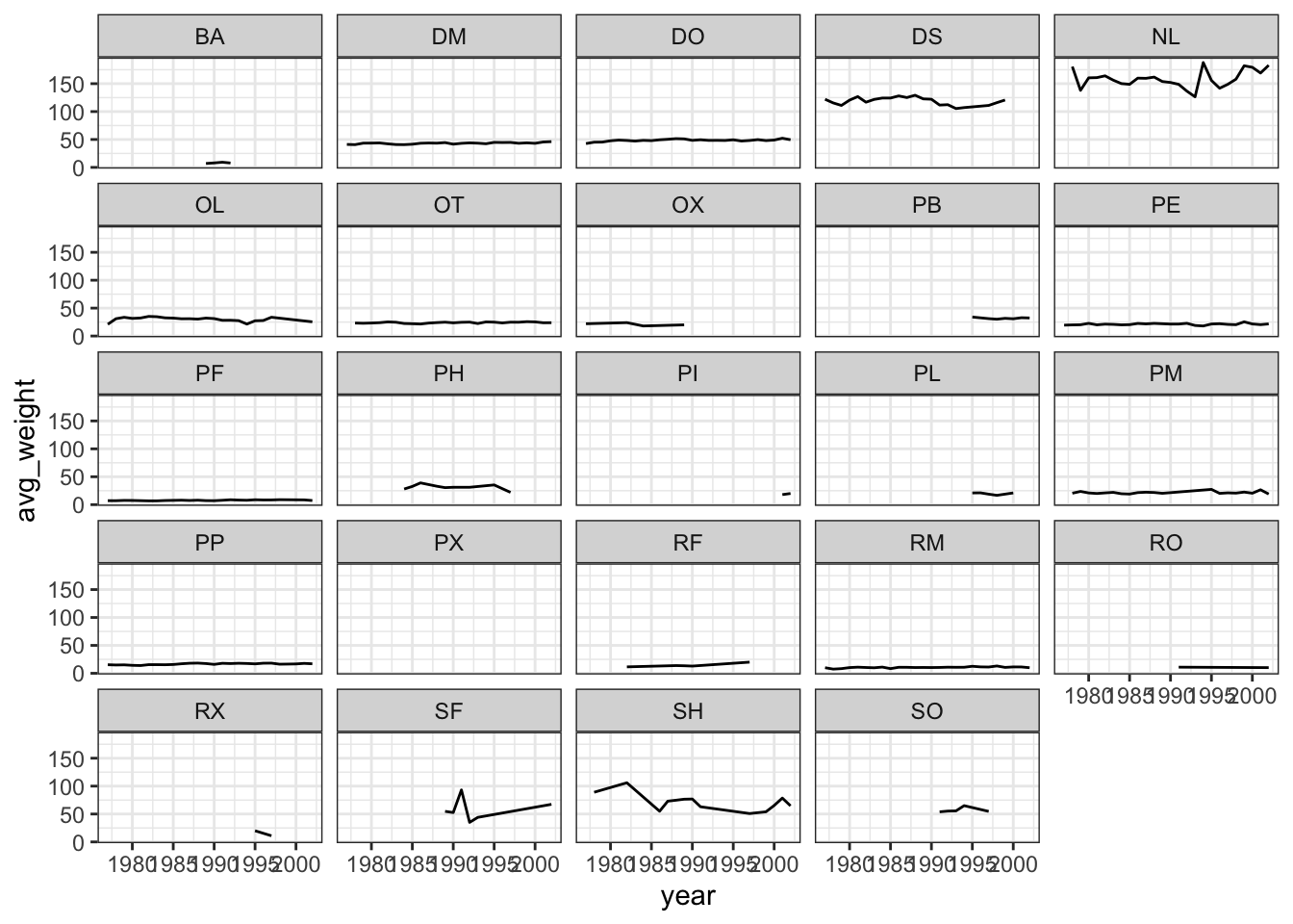
This lesson was contributed by Martha Zillig.